A two-evening international event in 2026.
The festival
Aetheric Echoes is a two-night live event presented by Aetheric Recordings – a label dedicated to music that resists easy categorisation: neofolk, industrial, post-folk, ambient, and the nameless spaces between them. The first edition took place in March 2026 at Kirtimų Kultūros Centras, Vilnius, drawing artists from Lithuania, Poland, Finland, Canada, Prussia, and Ukraine, and an audience that came as far as France and the Netherlands.
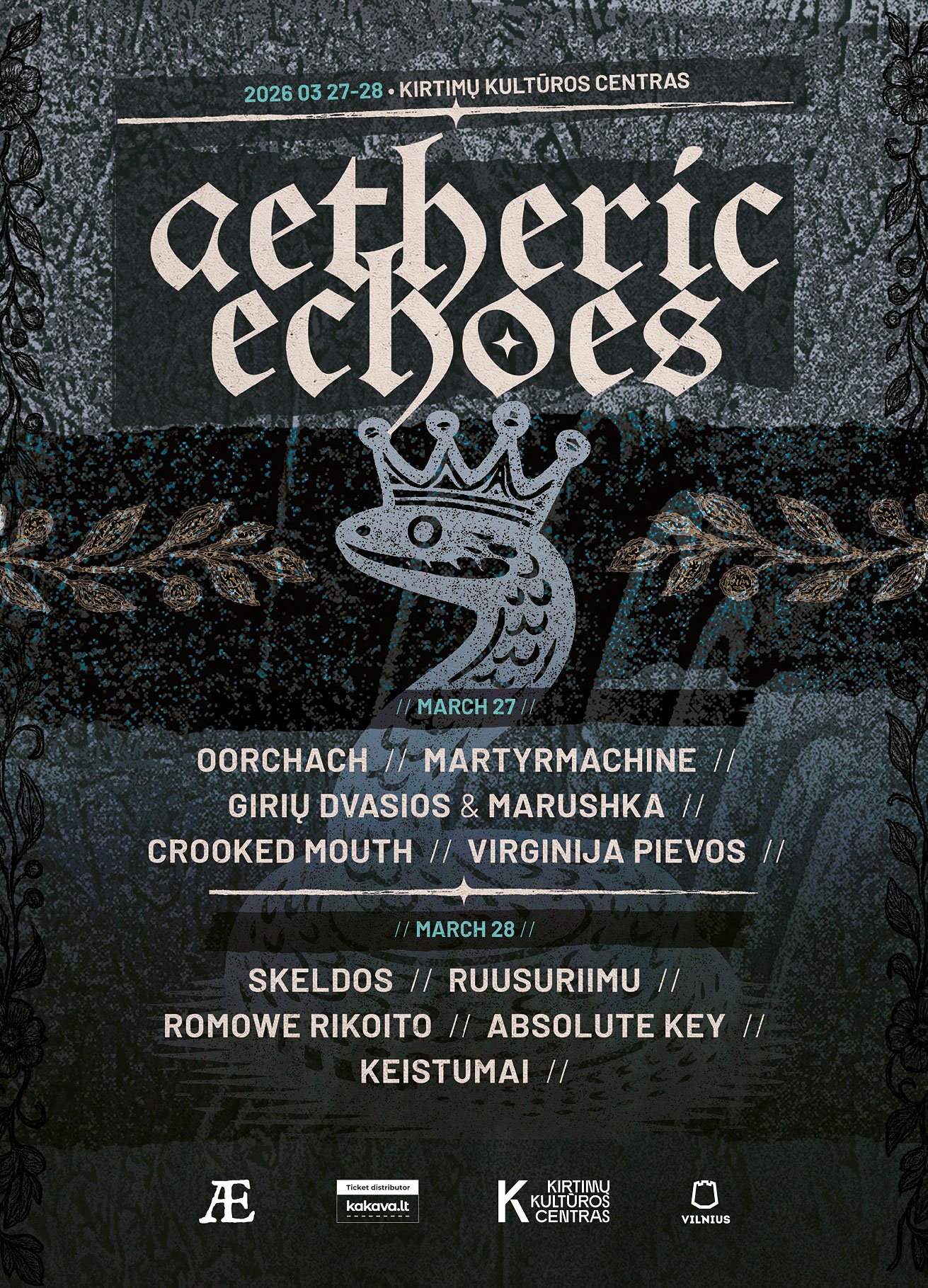
The organiser, Ian Campbell, built the event around a precise intention – to mark the transition from winter to spring through sound, moving from folk through industrial into noise and ambient across two evenings. A carefully curated event with deep personal connections, consciously showcasing some of the most vital sounds in this underground world.
The visual identity
The brief demanded a visual language as rooted and uncompromising as the music. Rather than reaching for generic dark-festival aesthetics, the identity draws from the Baltic collective unconscious – the symbolic reservoir that this music, at its best, already inhabits.
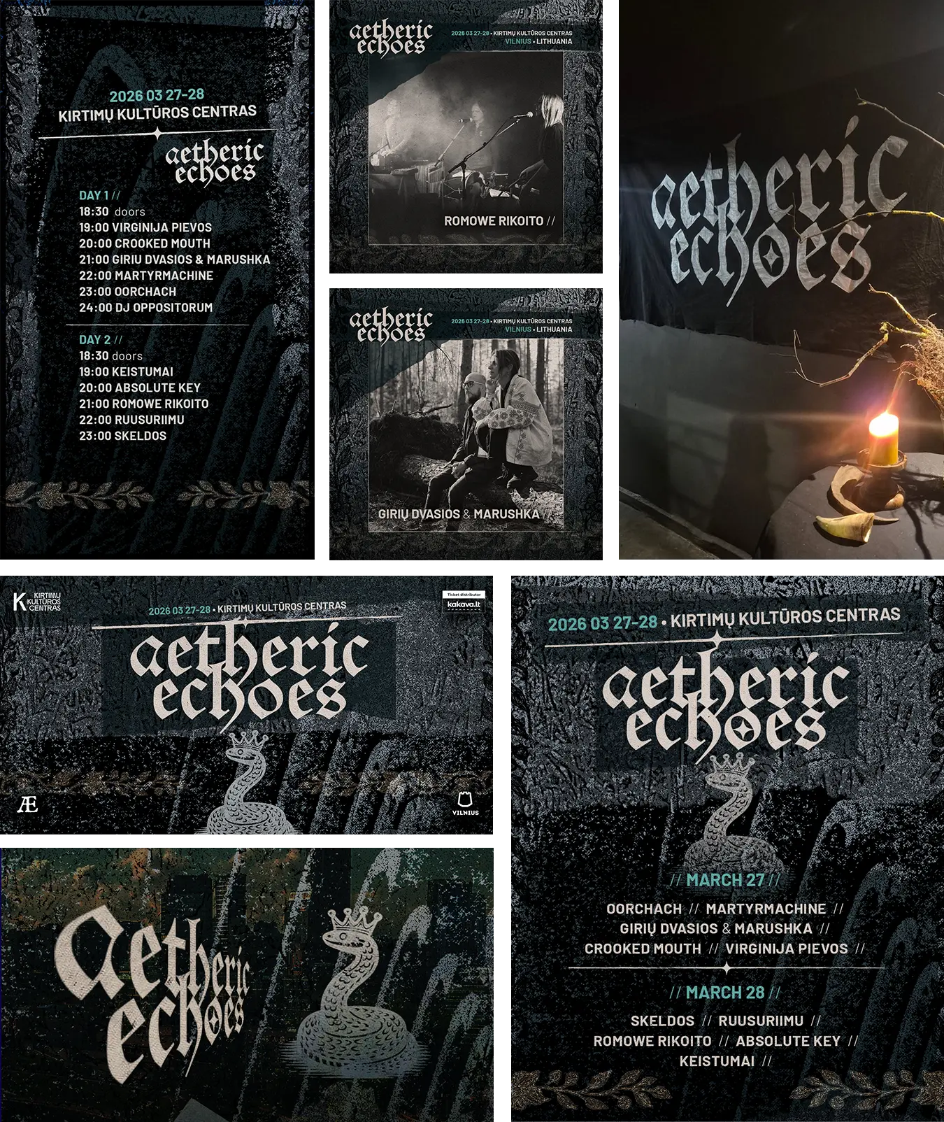
The central image is the grass-snake wearing a crown: a mythological figure embedded in Baltic folk tradition, a creature of the threshold between worlds, neither domesticated nor threatening – sacred in the older sense of the word. The festival’s lettering is set in Alte Schwabacher – archaic and deliberate. A deep blue-dark palette, botanical ornament, and scattered details build a visual atmosphere that holds consistently across the event cover, poster, flyer, stories, and band placement posts – a complete identity system.
The visual work and the festival’s world occupied the same symbolic territory without one illustrating the other. That’s the only condition worth designing for.
Reach
Prior to the festival, organiser Ian Campbell and I discussed the event in a live conversation on LRT OPUS, the Lithuanian national radio’s culture programme.
Following the festival, Campbell wrote: “Povilas did fantastic graphic design for us.” The event was an artistic success – with international attendance, and a second edition already announced.
Beyond the visual work, I performed on the first evening as the closing act – which perhaps explains why the identity felt like it came from inside the event rather than outside it.
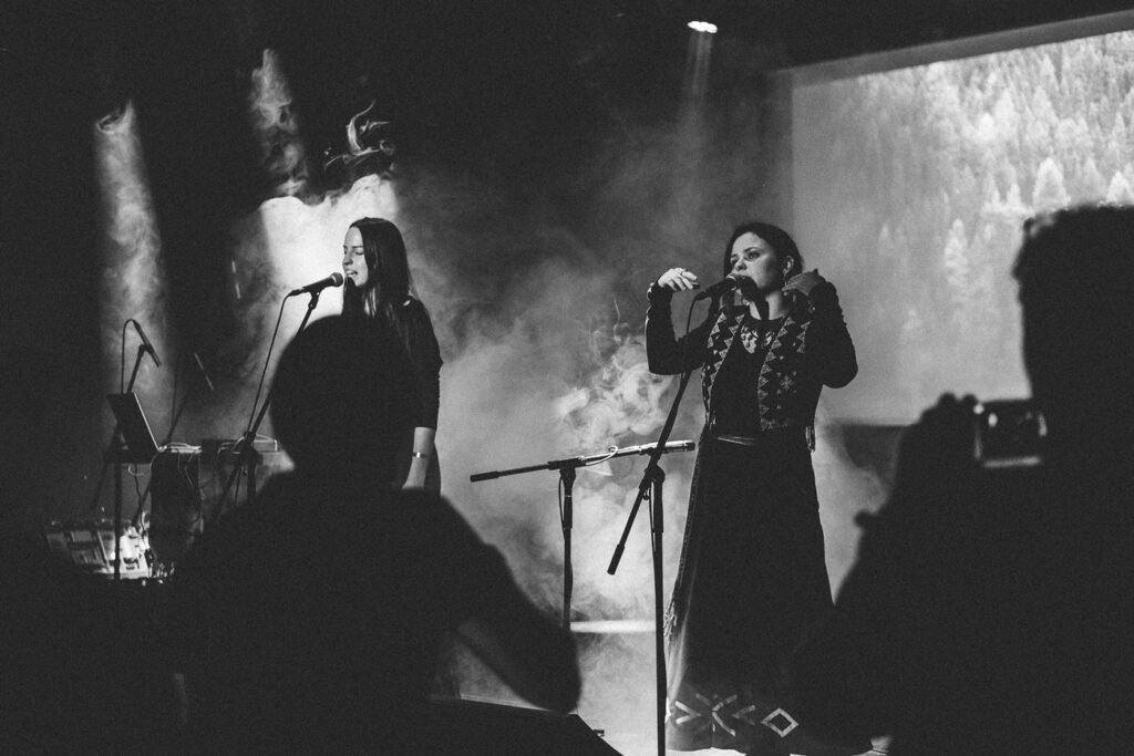
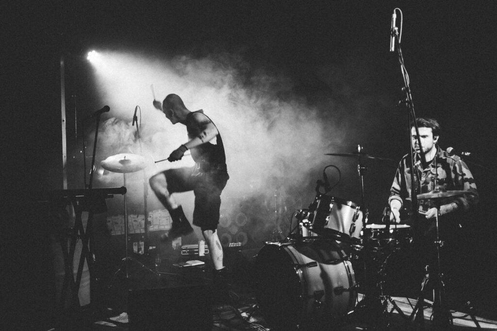
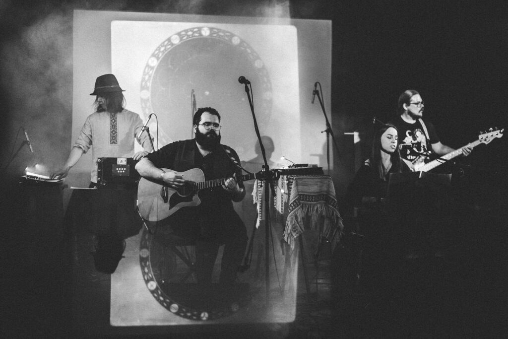
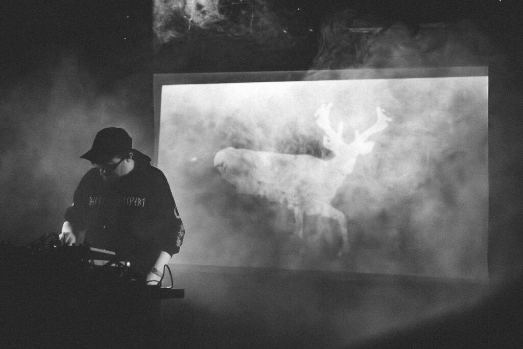
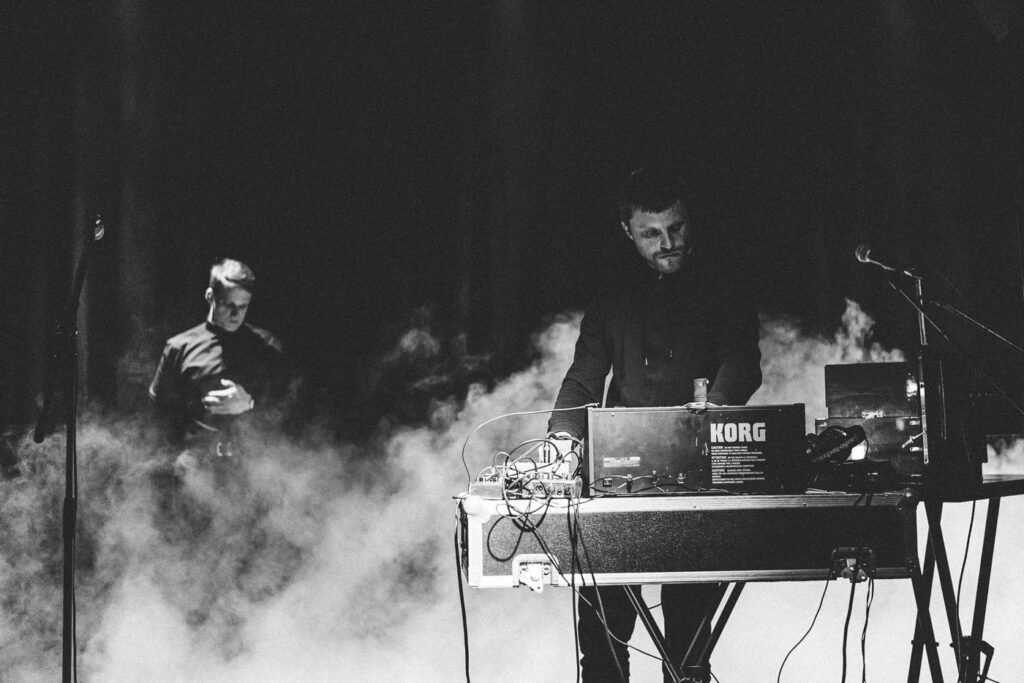
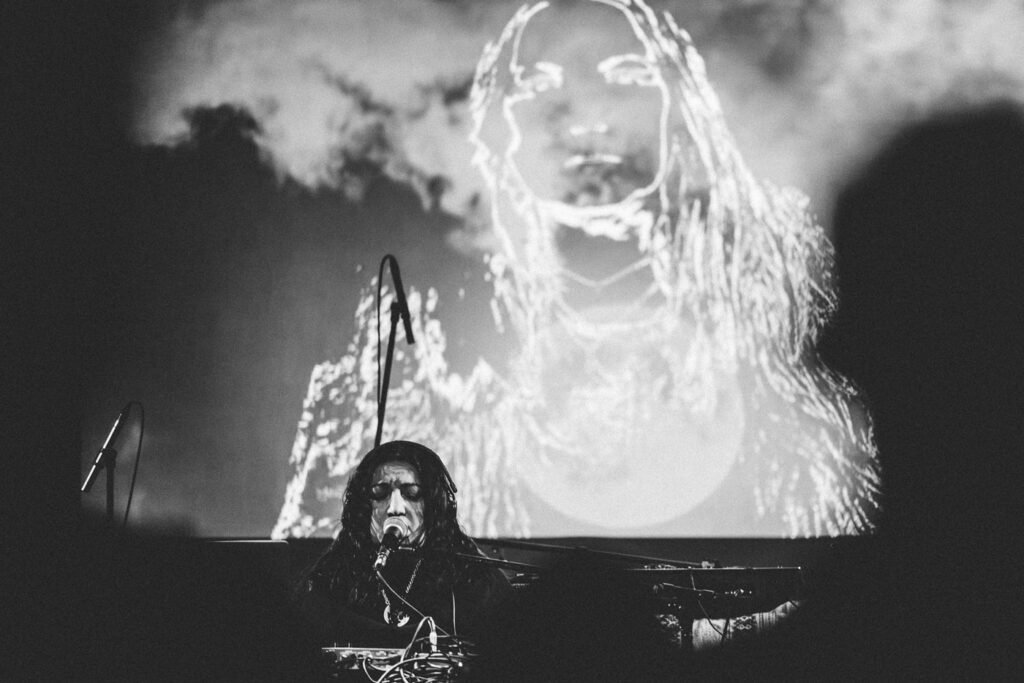
Festival photos by Julita Dargytė / Sutemose:


Related links

